ABOUT THE PROJECT
This was a short-term project I worked on to design a website for a report that was in a PDF-only format in order to make it easily accessible and more usable.
My Role: Lead UX/UI Designer
Team: Project Manager, Product Owner, UX/UI Designer, Developers, Stakeholder
Deliverables: Market Research, Heuristic Analysis, User Flows, Wireframes, Hi-fidelity UI mockups and Prototypes.
When: 2019
What: Website
Project Type: Redesign
DISCOVERY/REQUIREMENT GATHERING
We started with a kick-off meeting with the entire team - Project manager, Product owner, stakeholder, developers, and myself, to understand the current scenario and the expectations. My role as a UX/UI designer was to come up with wireframes and high-fidelity mockups for the homepage and an interior page. For data visualization display, the team decided to use Tableau which was handled by another team member which was later incorporated into the designs.
BACKSTORY
*Information provided by the project manager and product owner/researcher.
The U.S. Department of Defense (DoD) prepared a Demographic Report annually to present a synthesis of demographic information describing members and families in the military community. The team had been developing the report in the form of a multi-page PDF for many years. It contained mostly tables and figures of demographic data of active members and families. The PDF report was accessible from the main Military OneSource website. It served as a reference tool for professionals who developed policy or deliver programs and services to military members and families in the Armed Forces.

TARGET AUDIENCE
The product owner mentioned that the PDF report is widely used by a variety of audiences from academic researchers to organizations who wish to provide targeted services to the military and to the general public.
Heuristic Analysis
I did a heuristic review of the Military OneSource website and the PDF based on some of the Nielson Norman group usability heuristic principles to identify usability issues.
ProblemS
The PDF document takes too long to read through since it requires a lot of scrolling.
There is no proper way to navigate between different sections/chapters making it difficult for readers to find what they need.
SOLUTION
Based on the information provided and the heuristic analysis the team’s goal statement was -
“To convert the PDF report into a website to make it easily accessible and more usable.”
REQUIREMENTS
I went through the provided requirements and some of the layouts the team had suggested for display.
Display the sections/chapters and other information in a menu to make it easily accessible from all the website pages.
Create a homepage displaying all the chapters in one place for easy selection.
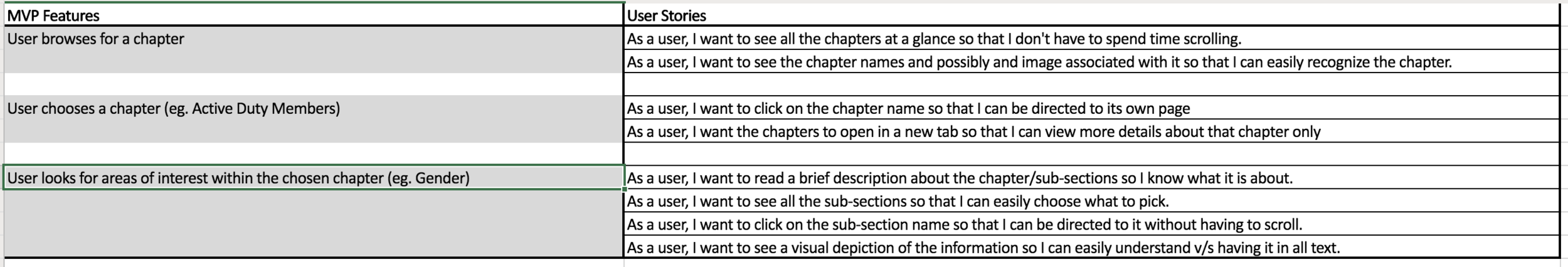
User Stories
The requirements were then converted into user stories for Minimal viable features.
BRAINSTORMING, ANALYZING AND DESIGN PLANNING
Moodboard
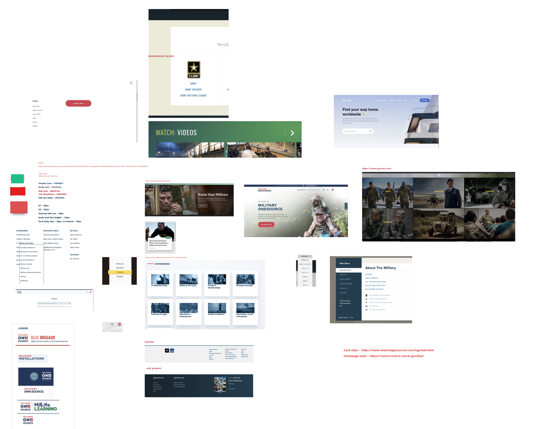
I started creating a moodboard in Sketch gathering screenshots for the homepage and interior page layouts. Most of the inspiration came from other subsites of Military OneSource website like logo, banner, and cards. Dribbble and Google images were my other go-to resources.
TASK Flow
Based on the user stories, a basic task flow was created. The user will start from the Demographics Profile page of the Military OneSource website.

Sketches/Wireframes
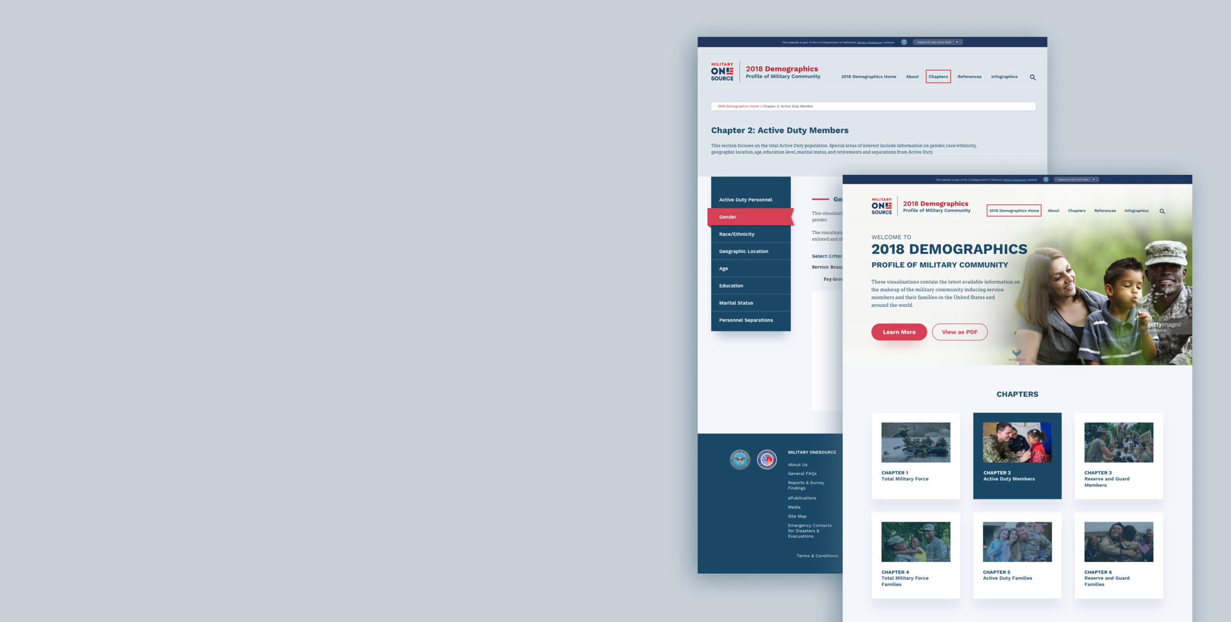
After multiple iterations, I came up with rough sketches and Axure wireframes using the moodboard and user stories. During the design phase, there was content ready only for chapter 2. Hence, Chapter 2 was used in the wireframes and visual mockups. The menu was created from the groupings in the PDF. “Infographics” was added later based on client requirements. A content strategist helped me with the menu labels and footer text and it was being approved by the manager.


VISUAL UI DESIGN
Style Guide
The style guide was provided since we had to follow the colors and patterns from the parent website where the Demographics report website would live.
Logo
The logo was inspired from another subsite title. Once the website title that the content strategist came up with got approved, I appended it to the Military OneSource graphic/badge that was provided. The title changes every year.
Fonts
Fonts are open-source and publicly available and match the parent website. Work Sans is used for headlines, call-to-action buttons and menus whereas Arvo is used for descriptive paragraph text.

Colors
The color palette was chosen from the Military OneSource style guide to keep things consistent.

Buttons
These button styles required to follow the parent website standards. Reset buttons were created for the Data Visualization team to be used on the interior pages.

Ribbons
I created two colors for active menu ribbons for the left hand navigation on the interior pages. Red was finalized. I suggested to make it a plain red background for active menus if the ribbon style was not possible to develop or time consuming.

HIGH FIDELITY DESIGN MOCKUPS
The style guide was then applied to the wireframes and was eventually turned into high-fidelity visual mockups with multiple iterations created in Sketch.
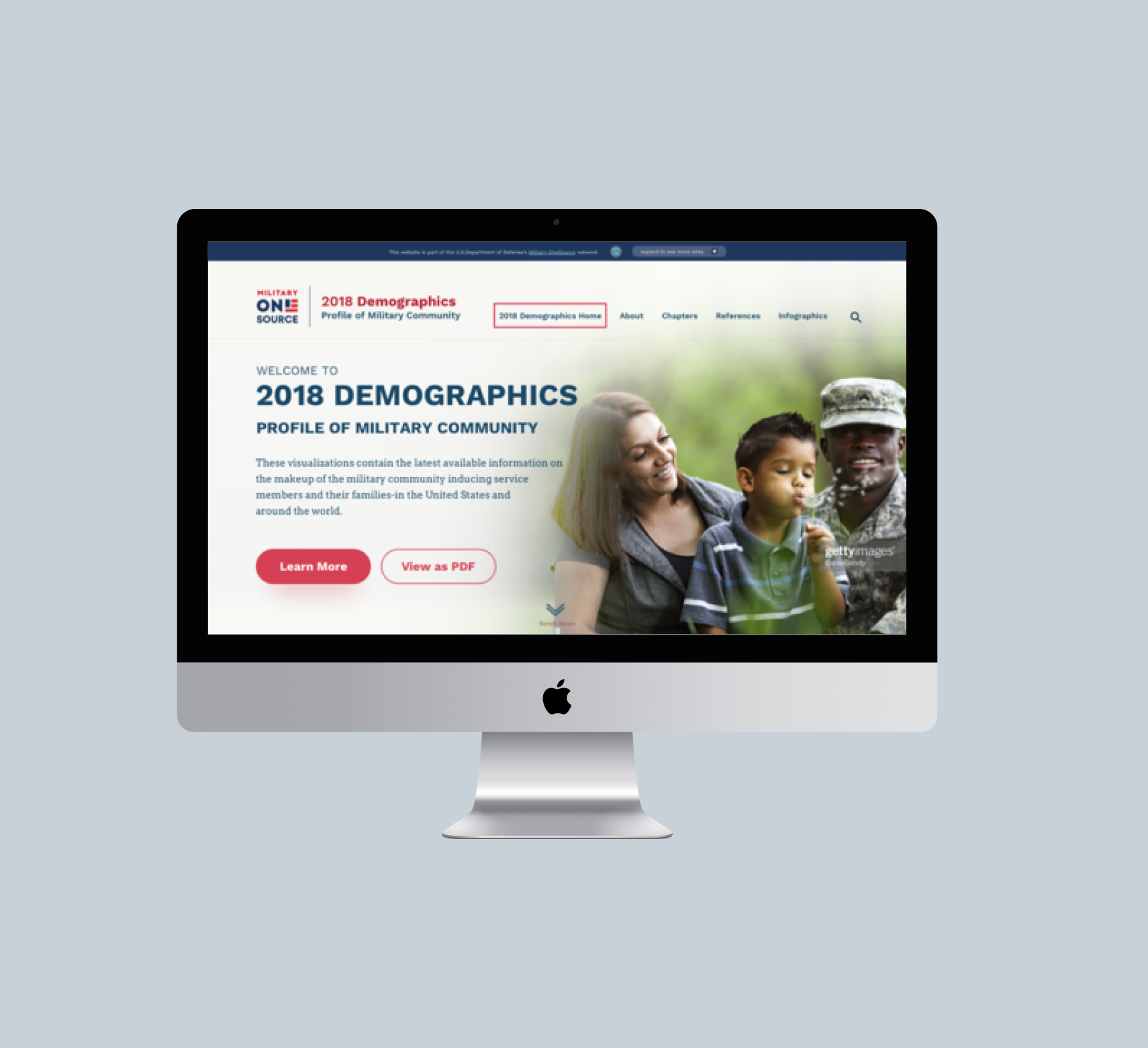
Chapter 2 is shown as the active card upon hover. The animations were explained to the developer using the Military OneSource site. The images and badges were provided to me by the team along with the style guide. I worked with the content strategist to fit the text in the banner and footer areas. The data visualizations in the interior pages are screenshots and are used for representation purposes.
Homepage iterations


Interior page iterations


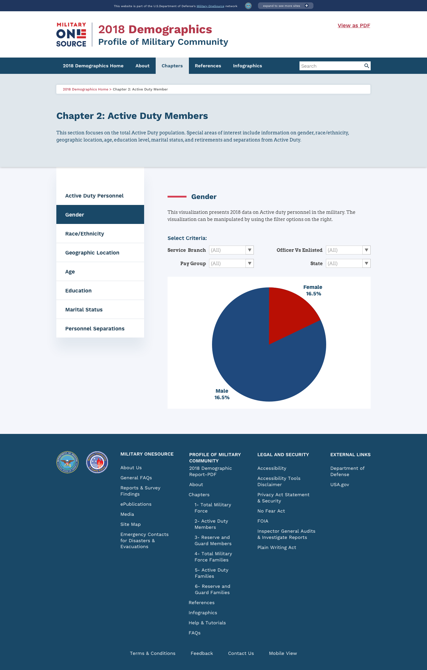


The ribbon for the selected menu matched the military theme.
Approved Designs
Once the below designs were approved I handed them off to the developers along with the specifications in Invision and other necessary assets. I guided them when needed during the development phase.


CONCLUSION
Impact
The designs were still in the development phase and had not been launched then. I did not see the live site but it would make accessing information very convenient.
Reflections/Challenges
This was my first-time moving content from a PDF into a website and it was a challenge figuring out how to condense a large scrolling PDF into web pages.
The biggest challenge was that there was no real user testing that took place and I would love for that to happen at every stage before moving on to the next to be on track. But due to time and budget constraints it had to be skipped. For future projects, I want to make sure upfront that user testing is considered.
It was a great experience doing visual UI tasks when I was not supposed to, as the UI part is usually handled by a different team. I grabbed the opportunity and completed it which got appreciated.
Next Steps
Do a user test.
Update homepage to display more chapters incase PDF evolves.
Add microinteractions/animations.
Go to a different project