ABOUT THE PROJECT
This is a redesign of the picnic area reservation website (subsite of a city website) in order to make it user-friendly and allow online reservations.
My Role: UI/UX Designer
Deliverables: Market Research, Competitive Analysis, User Flows, Wireframes, Hi-fidelity UI mockups, Prototypes and animations.
When: 2021
What: Website
Project Type: Redesign
DISCOVERY/REQUIREMENT GATHERING
BACKSTORY (The Why)
We are frequent visitors of the Central park located in Fremont, CA. I found out there are picnic areas that could be rented out for events. So my husband and I decided to try one for my son’s birthday party. I was looking for a picnic area that allows a small group of people and at a convenient time and affordable price. I checked their website and after struggling for a bit to find a spot, we were able to reserve one. The reservation and payment had to eventually be done in-person at their office which was tedious. The site needed a redesign to make the process easy.
TARGET AUDIENCE (The Who)
This website is for the general public who love being outdoors and like to host events - corporate or family.
CONTEXT (The When/Where and The Needs)
In a real team setup, there would be user research conducted at this point through interviews and surveys mainly by a user researcher to understand user’s pain points and needs when looking to make reservations. Since I did not conduct the user research, I made assumptions about users and their needs.
When - The user will use the website when he/she is planning to host an event.
Where - I’m assuming the website will be accessed mostly from desktop and possibly on mobile too.
Needs/reasons/problems faced - To get the spot they want at the planned date/time and at an affordable price.
Feelings - anxious, uncertain.
Assumptions - The users know how to navigate to the website from the city website.
Problems
I analyzed the current site and found a lot of issues that needed to be addressed for a good user experience.
The site is pretty outdated.
Menu on the left is confusing.
Images and maps are not user-friendly. Images cannot be manually scrolled. A realistic 3D view of the locations and park may be helpful. Currently, a PDF image is used for maps.
Inconsistency between pages. Hard to follow.
No back button. Have to use breadcrumbs to navigate to previous pages.
Multiple links are wrong and confusing to the user.
Payment for the reservation has to be done in person or by email which is inconvenient and time-consuming.
GOAL (What are we designing?)
My goal was to improve the user's overall experience in navigating and reserving a picnic area online easily.
REQUIREMENTS (or User Stories)
I associate my goals with a set of requirements and/or user stories.
Upgrade the site to make it look visually appealing and user-friendly in order to easily view and reserve a picnic area.
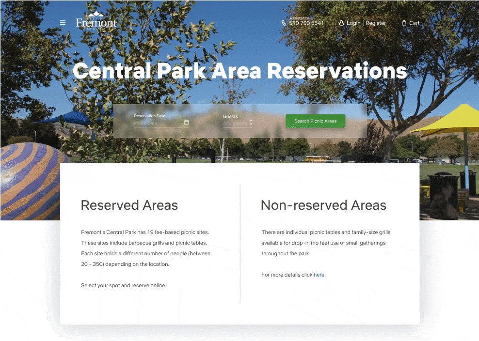
Display various picnic areas and details with easy navigation.
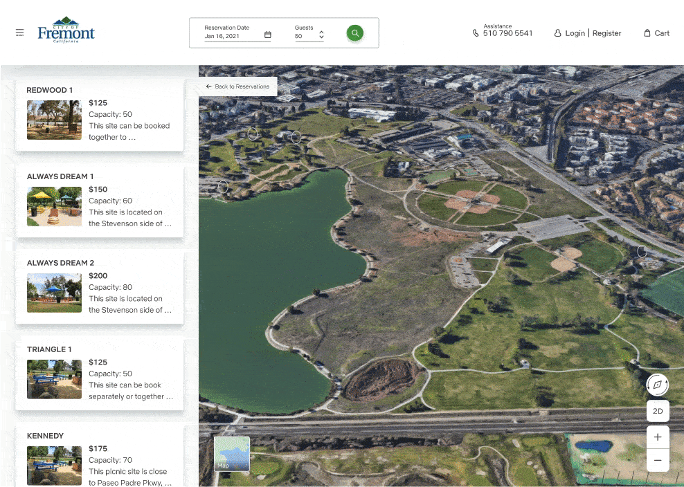
Allow users to view the park in 3D using Google Earth API.
Provide different pictures of the picnic areas.
Provide 360/in-person views of the desired picnic area.
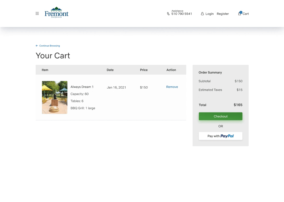
Allow users to choose and reserve online with an easy checkout process.
BRAINSTORMING, ANALYZING AND DESIGN PLANNING
MOODBOARD
I started looking for inspiration and created my moodboard for homepage layouts and components like search, map, and payment.
SKETCHES and TASK FLOWs
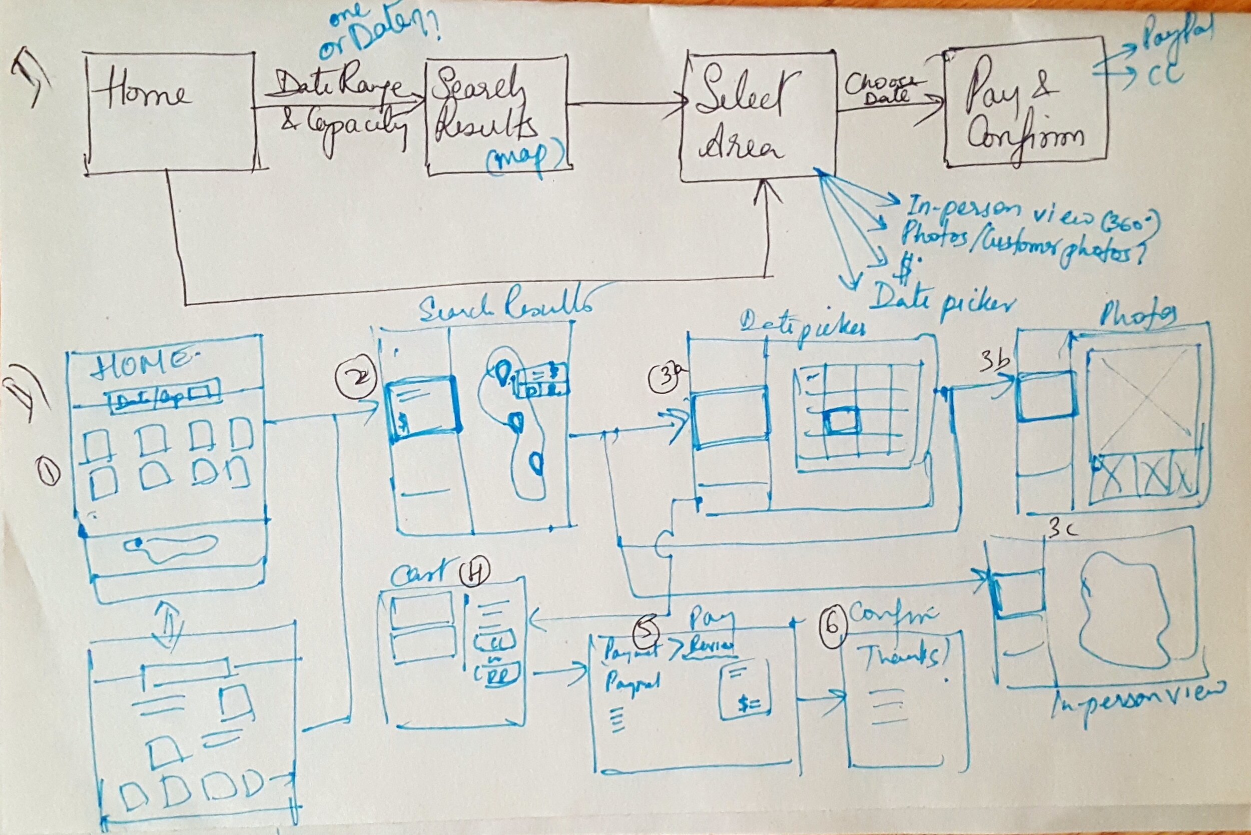
Flow 1 - when a user needs options to choose from various picnic areas via search. I went with this flow for my designs so I can show the use of a calendar during search.
On the homepage, select date and capacity and check available picnic areas.
Choose a picnic area from search results and add to the cart.
Checkout via PayPal or credit card.
Review and Pay.
Order confirmation.
Challenge - For the date selection option on the homepage, I initially chose to use a date range selection criteria instead of choosing a single date in order to give users more options to choose from if a picnic area is not available on a particular date. However, since the reservation was for a single day event, that led to having users choose a single date on the search results page which was kind of a redundant task. Hence I changed it to a single date selection criteria. I would go through a user testing session for this to make sure I’m on the right track.
Flow 2 - when the user wants to choose a specific picnic area directly from the homepage.
On the homepage, choose a picnic area.
Select a date and add to the cart.
Checkout via PayPal or credit card.
Review and Pay.
Order confirmation.

Homepage v1
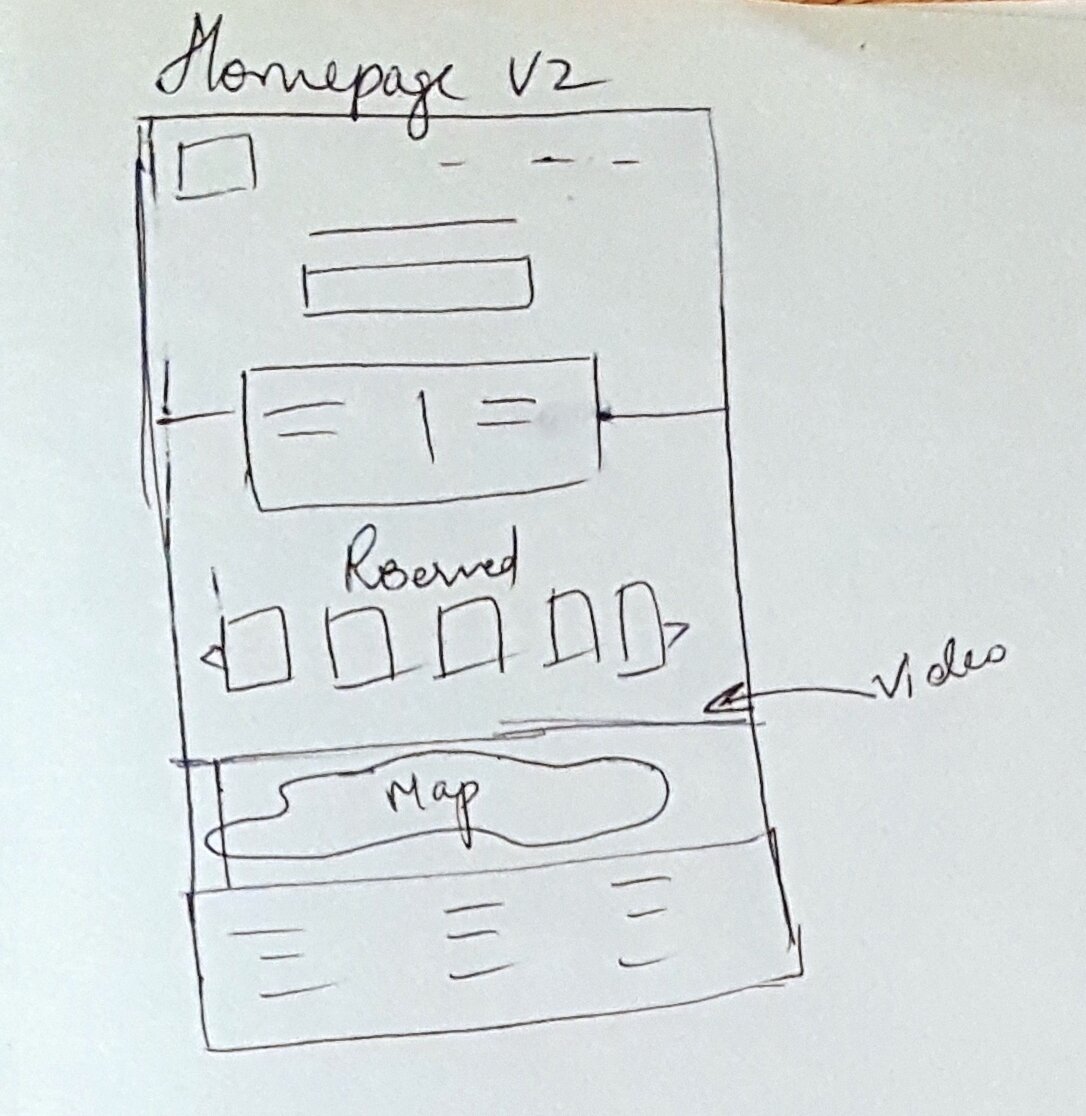
Homepage v2
Challenge - The current site shows more information/text about the non-reserved (drop-ins) areas compared to the reserved areas. Hence, I wanted to initially display them as in the sketch “homepage v1” with all the reserved areas displayed below. But since I didn’t want the reserved areas to get lost at the bottom of the homepage I moved it up (homepage v2) by putting the information part in a container (I reduced the non-reserved area text size as seen in the wireframes which usually will be done with the help of a content strategist). It will be useful to find if the sketches are on the right track by user testing.
WIREFRAMES
Why I made certain UI decisions?
Using Airbnb as my reference point.
Used 3D map for realistic view of the picnic areas.
Rectangular buttons - wanted it to be consistent throughout the designs and match the current site. Also wanted the shape to match the rectangular search container on the homepage.
* Click and mouse over the images to see description.


VISUAL UI DESIGN
Style Guide
I went with the current site’s logo and color choices.

HIGH FIDELITY DESIGN MOCKUPS
After applying the style guide and iterating a few times this is what I came up with.


PROTOTYPES
Homepage Search Flow
Search Results
Payment
THE BEFORE AND AFTER!


CONCLUSION
Reflections/Challenges
User testing would have helped make design decisions faster.
The content was a challenge. In a team environment, I would collaborate with the content strategist to get help with the text on each page.
Next Steps
Track success metrics for users and business.
Success Metrics (users)
More reservations made via online payment.
Availability rate of the picnic areas per month. More reservations = Less availability.
Number of assistance calls. Less calls could mean users are able to reserve online without enquiring.
Success Metrics (business)
More reservations per month.
More returning customers.
Make it responsive.
Go to a different project