ABOUT THE PROJECT
This is a mobile app for a start-up to find location-based security services.
My Role: UI/UX Designer
Team: UX Designer/Project Manager, UX Designer, UX/UI Designer
Deliverables: Market Research, Competitive Analysis, User Flows, Wireframes, Logo Design, Style Guide (Color, typography, iconography), Hi-fidelity UI mockups, Prototypes and animations.
When: October 2022 - March 2023
What: Native Mobile app
Category: Booking app
Project Type: Client work
DISCOVERY/REQUIREMENT GATHERING
We started with a kick-off meeting where the three of us met online to understand the current scenario and the expectations. My main role was to come up with high-fidelity visual mockups.
BACKSTORY (The Why)
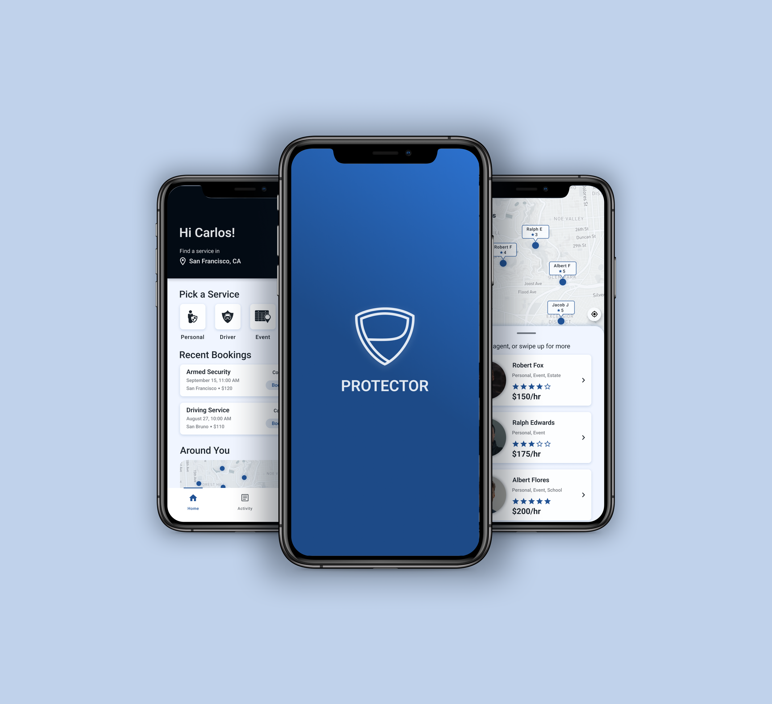
The stakeholder was looking to have a bodyguard security app (similar to Uber) where users could find security for themselves, events, etc based on their location.
TARGET AUDIENCE (The Who)
Two main users - protector/security agents and customers (Celebrities, schools, big events, high/middle-class people looking for personal drivers, business/stores). For this project, we were responsible for the customer flows.
CONTEXT (The When/Where and The Needs)
The stakeholder provided detailed instructions and app idea to help us get started.
When - The user will use the app when he/she needs security at a particular location and day/time.
Needs/reasons/problems faced - There are very few apps available for personal security. This app will make things easy for users to purchase security services at their own fingertips when needed.
Where - anywhere.
Feelings - anxious.
Assumptions - Location is turned on by the user.
COMPETITIVE ANALYSIS
I spent some time looking at similar apps like Bond and Bodiguard apps to get an idea of what can be added or avoided in our app.

GOAL (What are we designing?)
Design a native mobile app that allows users to find and book security services easily.
REQUIREMENTS
Based on the requirements provided by the stakeholder and the competitor analysis, the key tasks obtained were:
Sign up/Login
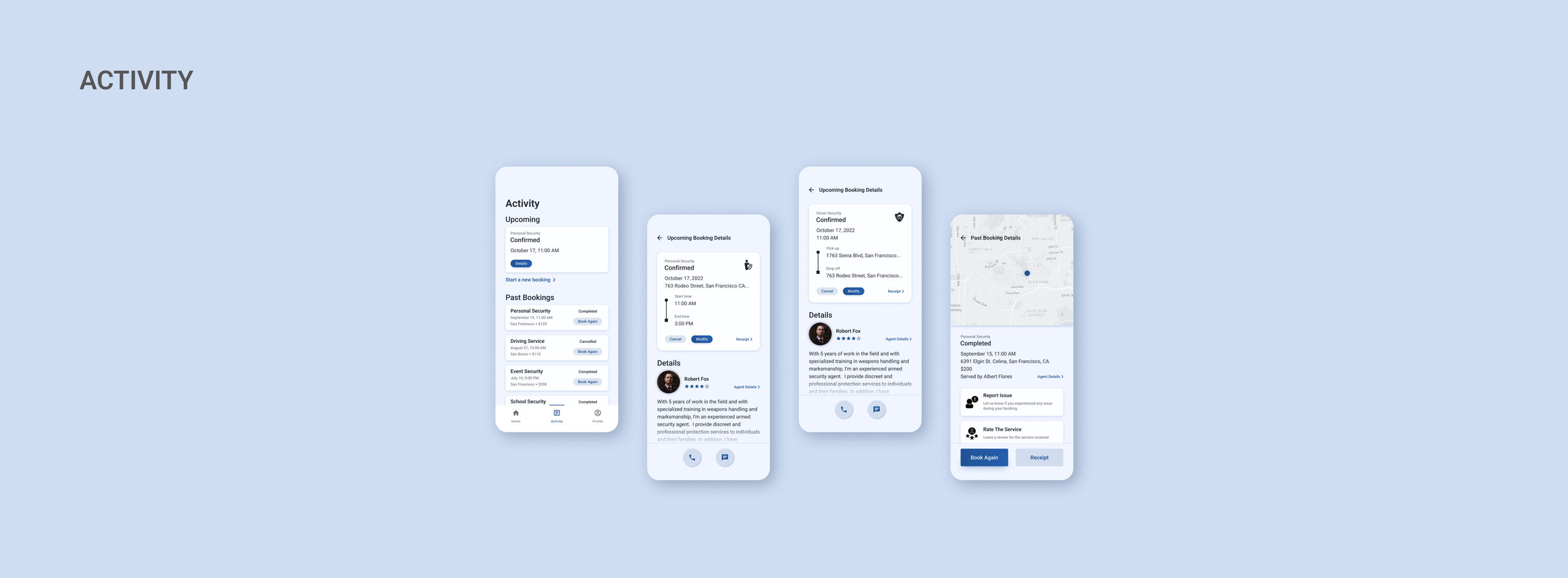
Search and book security agent
View current and past bookings
View profile
BRAINSTORMING, ANALYZING AND DESIGN PLANNING
MOODBOARD
After having a clear understanding of the problem and studying the requirements we then looked at some booking apps like Uber and Lyft for inspiration. I also took inspiration from Dribbble, Google images, and Pinterest for flows and components and came up with a moodboard.

TASK FLOWs and sketches
The UX designer worked on the initial flows for signup and booking service/agent and associated them with rough sketches which she then converted to low-fidelity wireframes. This gave us an idea of how the app would look and function.


After a feedback round, we together worked on the app/task flow in Miro which helped us shape the user journey and experience. Based on the requirements given and the inspiration, we came up with 3 key features - Home/Search, Activity/History, and Account/Profile that we used to create the flows. After multiple iterations, we were able to finalize and proceed to the next step.

We then split up and started working on individual flows, sketches and wireframes. I was mainly responsible for the Booking flow.

WIREFRAMES
Once we established our flows and sketches, we started creating the mid-fidelity digital wireframes for our respective flows that we worked on individually, mine being the Booking flow. After going through it together and making few changes, the wireframes were then presented to the client for feedback which was approved.

VISUAL UI DESIGN
Style Guide and logo design
It was time to create the hi-fidelity screens. I used Material Design guidelines to define the fonts and icons. My team members helped gather the graphic icons from the Noun project website. For colors, I used the Color Hunt website for ideas and Matercolor [material design color] plugin for getting the color scale. Chose blue color as it looked muted and appropriate for the app,
The rectangular button shape was based on moodboard. I wanted it to look sharp for app.
I took up designing the logo as well. There was no specific instructions given by the client. I looked at some inspiration online and came up with few options and got it approved from my teammates.
HIGH FIDELITY DESIGN MOCKUPS
I ended up creating 63 hi-fidelity screens after multiple iterations for all the flows. I also worked on the onboarding screens and improvised the login flow. We (team members) got together for feedback during the process and iterated over the screens multiple times until the stakeholder approved it.


HAND OFF
After adding the final touches like graphics, images that my team mates helped find and tweaking the copy/text for the app, the mockups were then presented to the client. The feedback was positive and was approved for development. That led us to write developer notes besides the screens that would help during development process.
CONCLUSION
Takeaway - This was a fun collaborative project with a global team. In spite of the time difference, we managed to do regular stand ups and check in with each other inorder to complete this project in a seamless way.
Challenges -
Besides the time difference, I faced a few challenges while coming up with the sketches and hi-fidelity mockup screens as client instructions were not very clear for certain things, but with the help of my team members I was able to rule out any doubts I had before proceeding.
There was no direct contact with the client or users which didn’t allow for a usability test. I had to iterate based on client’s written feedback or design review with peers.
Future updates - There are plans in the future to design screens for the other set of target audience - the security agents providing services.

Go to a different project