ABOUT THE PROJECT
This is a personal project for UI Design bootcamp at RookieUp. I wanted to design an Augmented Reality (AR) app that helps customers shopping in-store to try out clothes and checkout faster.
My Role: UI/UX Designer
Deliverables: Market Research, Competitive Analysis, User Flows, Wireframes, Logo Design, Style Guide (Color, typography, iconography), Hi-fidelity UI mockups, Prototypes and animations.
When: 2018
What: Native Mobile app
Category: Retail
Project Type: Conceptual
DISCOVERY/REQUIREMENT GATHERING
TARGET AUDIENCE
Someone who is tech-savvy and is too busy and impatient to wait in lines.
Competitive Analysis
To understand the problems, I looked at how similar apps work like the following:
GAP AR - does not have a wide range of AR body type options.
In VR rooms like FXMirror_3D Virtual Fitting Solution, the positive is that you can see your full image in real-time and the image is stable but using the hand gesture is tedious and can get painful. Also, it defeats the purpose of avoiding lines since one would have to wait for his/her turn to use a VR room/FXMirror. If it's in the open, privacy could be an issue as well.

Whereas in an AR situation like Armenian National Costume it's not possible to see a full-size self-image in real-time as one needs to hold the phone themselves unless someone else like a friend holds the phone and checks the fitting for you which may not work for all.

Problems
Fitting room - There is no easy and faster way to try on clothes in stores. Customer must wait in lines to get a room which could be a time-waster. He/she ends up skipping or leaving the lines and choosing the wrong outfits or not choosing one at all.
Checkout – The checkout process could also be slow especially during the holidays. Customer must wait in long lines again which is time consuming.
Solution/GOALS
Design a simple and easy-to-use in-store mobile app for a clothing store that allows users to try on clothes using Augmented Reality (AR) with minimal effort.
Design an easy and fast way to checkout automatically without having users wait in long lines to pay in-store.
User Stories/Requirements
Based on the problem and solution defined above, I came up with key tasks in the form of user stories that users would follow.
As a user, I should be able to sign up
As a user, I should be able to create an account
As a user, I should be able to save my credit card information
As a user, I should be able to login using a Google account
As a user, I should be able to scan (QR code) and enter the store
As a user, I should be able to scan the barcode on items and view them on the phone
As a user, I should be able to either try or add items to the cart
As a user, I should be able to view/try the clothes on a real size
As a user, I should be able to select and delete items in the cart before checkout
As a user, I should be able to checkout and pay automatically using the credit information saved
BRAINSTORMING, ANALYZING AND DESIGN PLANNING
Moodboard
I then created a Moodboard in Sketch gathering screenshots for page flows, fonts, colors, icons, graphics, and overall layout. I used Dribbble and Google images for inspiration.

Task Flow/User Flow
Task flows were created using Axure. I got the inspiration for this user flow from Amazon Go app.
This is how it works/user journey
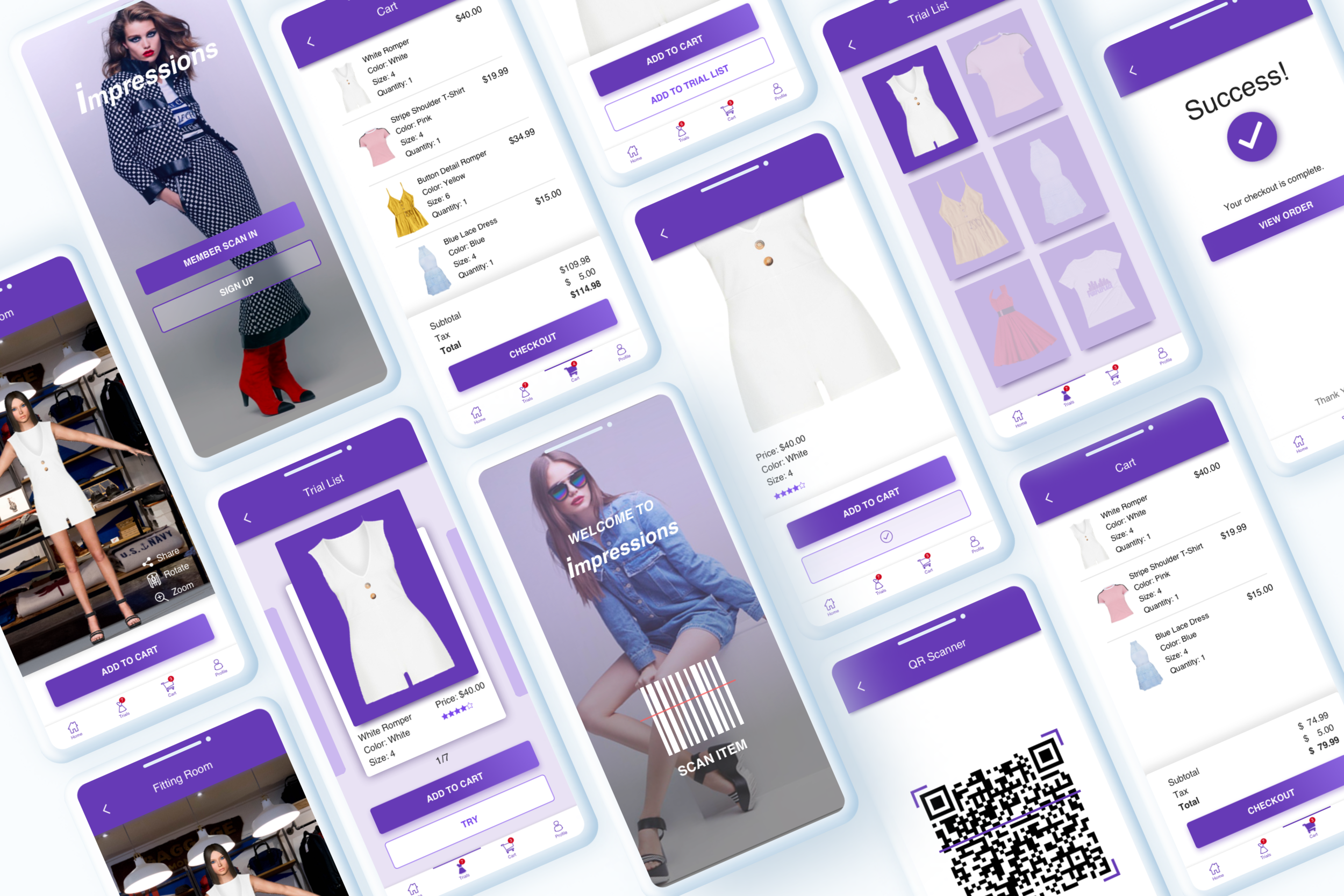
A user must have an account to use this app before entering the store. Once logged in, the user walks through the scanners where the body measurements will be collected and saved in his/her profile.
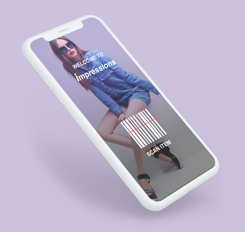
After scanning in, the user is then brought to the Welcome screen on the app. He/she can then start browsing clothes in the store.
If anything is liked, the user can scan the barcode of the item using the Scan button on the screen.
The image of the item then pops up for the user to view and decide whether to “Add to Cart” without trying or “Try List”.
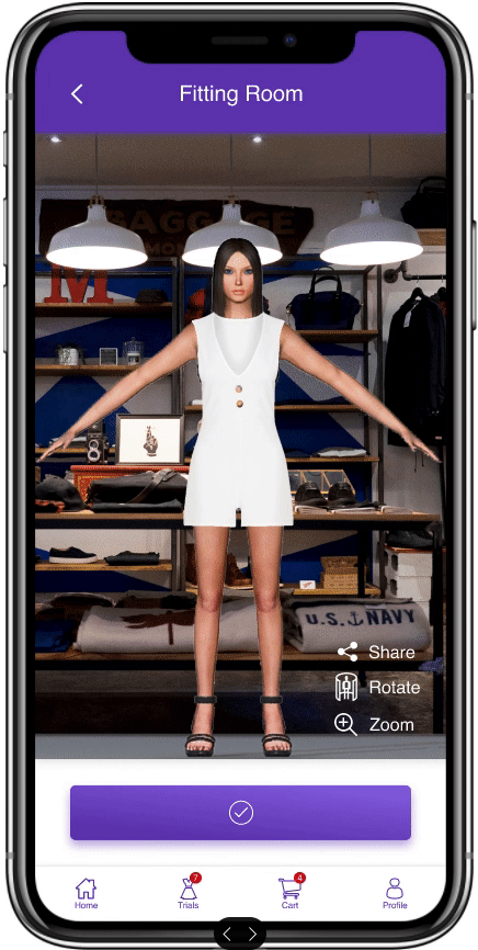
If the user chooses to try it, he/she can select an outfit from the Try list and try it on the full-length 3D AR model with the user's measurements that gets rendered on the screen.
If liked, then he/she will “Add to Cart”.
Once ready for checkout, the user will hit “Checkout” and walk out of the scanners. This will automatically checkout the user using the Payment details saved by the user in the profile.
Sketches
Referencing the user flows, rough sketches were made for the app’s screens using pen and paper.


Wireframes
The above sketches were then converted into digital wireframes using Sketch.
VISUAL UI DESIGN
STYLE GUIDE
The logo was an instant creation using plain text in italics. I thought about how one should feel choosing and trying out the clothes from the store - impressive. Colors - Since I pictured mostly women doing the shopping and try-ons, purple/violet came naturally to mind as the color for this app. I got my icons from Flaticon. For font, based on the moodboard and since it was clean and pleasing to read on an apparel app, I used Helvetica.
HIGH FIDELITY DESIGN MOCKUPS
After going back and forth with my mentor, I came up with these final screens created in Sketch as well. I used the moodboard I created earlier for inspiration on colors, fonts and images and even some layouts.

PROTOTYPE
Prototype created in Figma.
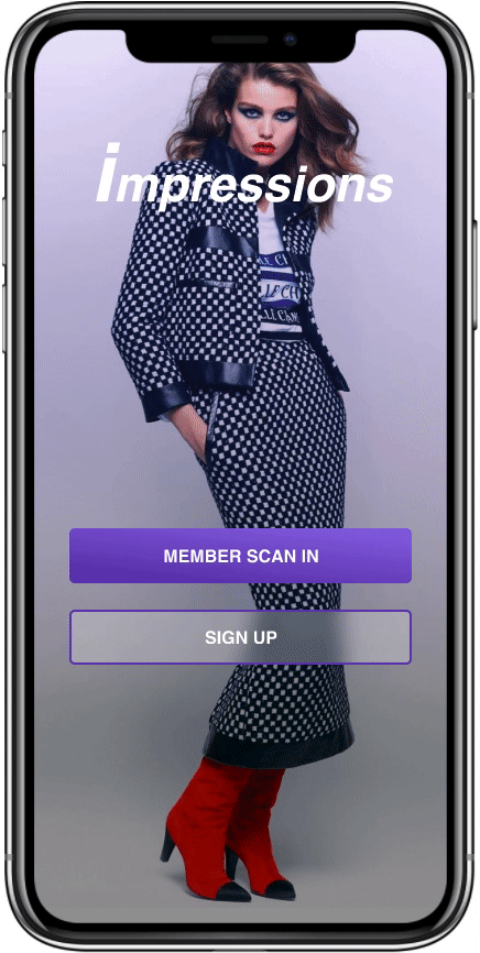
Member logs in and scans item

User tries on outfit
Checkout
CHALLENGES
The 3D AR model was challenging to decide. I initially pictured a real-time self-image on which the chosen clothes will be shown. But realized that wasn’t possible since I wanted a full-length image which is hard to obtain if you must hold the phone yourself. So I decided to use a 3D model with user’s current vitals that will be collected at the store entrance after getting scanned.
I wasn’t sure if I should add any Checkout process in the app or should the user checkout all the items in person. The latter would defeat the purpose of avoiding lines. Hence, I added the automatic checkout with just a scan where users will be billed to the Credit card details saved making Checkouts faster and hassle-free.
CONCLUSION
Since this was my first mobile app design, I had to put a lot of time into researching even the basic elements and placement. It was a good learning experience. Constant feedback from my mentor really helped me keep it clean and stay focused on the goal. I would iterate the mockups further given the time. A possible enhancement would be making the app available for online shopping as well and find potential users to run a user test.
Go to a different project